Pocket Schedule
Today, I wanted to talk about a little app on my phone that has, throughout my extended stint in Sheffield, greatly helped me plan out assignments, work, exams, and university classes.
This little app is called Pocket Schedule and is unfortunately only available on iPhone – though there are very similar variants you can find on the other types of phones. Now, this is basically a little guide to the app, the app itself, and its highly useful qualities that I find really helped me keep on top of university.
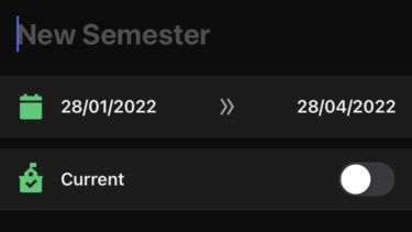
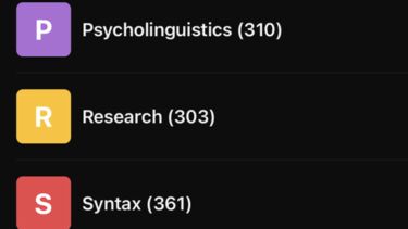
The first thing you’ll probably think of is what semester you’re in, which is great because this little app panders towards our needs of having a new semester every now and then, so we don’t have to have a single timetable and edit the whole thing. We just add a new semester and select the range of dates it falls within – you can even add holidays in between for things such as the Easter break. Each semester is blank, so you can add in your modules accordingly. The modules can be named as you wish and colour coded from a selection of about forty colours and also come up in a neat little list shown below.
Just to make sure you have enough detail, the app has capability to add in lecturers by name, affiliation, office location, and office hour times. You can even add a photo – but that may be going a bit far. The websites relevant to your course can be added here as well as their email and phone numbers (again, forget the phone number, that’s a little odd).
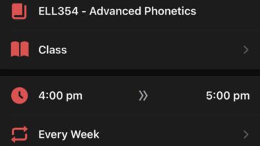
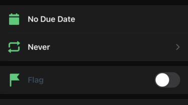
Once you have formatted your semester dates and added relevant tutors and modules, you can then click on the relevant module and add a class. You can add an entry for any day and time of the week, providing that it falls within the time window of the semester it is under, or else it will not appear. The app has a great ability to add lecturers, locations, class types, such as a lecture, study group, practical, or seminar, as well as the length of time these entries last. The last helpful thing about class entries is that they can be repeated daily, weekly, fortnightly, monthly, and a few other intervals, to save having to repeat classes that don’t happen each week and add ones that are common but not necessarily a semester-long scheduling.
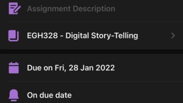
When it comes to work, we often have a great deal of assignments and submissions that we have to try and remember from the module outlines. Once in a while there is one that eludes the memory, and we go into a study overdrive trying to complete those things that we had forgotten about. This lovely app takes care of this, so when we have the slightly freer time at the beginning of the module, getting used to it and its study types, we could take a little extra time to put this into a planner. All assignments can be starred as important, as well as having anywhere from zero- to seven-day reminders of the upcoming due date and the time the work is actually due on that day. It separates all the assessments in a neat list by module, and you can toggle the selection to see the due dates by time instead.
There are also non-assessed tasks as an option, for example reading for a lecture, group project work, write-up hand-ins, and all manner of other things you may wish to add in there that either contributes to uni work, or whatever else you have going on in your uni life. You could even add in societies as modules if you were so inclined.
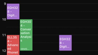
The next great thing about the app is that not only can you view the timetable as blocks of events happening per week, but there is also a toggle button that will allow you to see the timetable for the day instead of the week, and the colour correspondence really helps you to visualise what is when, not to mention the block size being representative of the time allowed for each session (yes, I know, this already happens in practically all timetables, I’m just excited about this app). After tasks and assessments are added, you can add exams, their locations, and lengths, and unlike assessments and tasks, these do appear on the timetable.
Overall, I find that the organisation in the early stages of the semester to be useful in removing a lot of future worry throughout the semester. Just sit down, check and double check all the necessary information. All of the module outlines don’t contain all of the same information in the same format, and nor do they pick out what particular classes you will be doing. If you’re lucky, the convenor will have created a timetable of assessments and tasks, but often, this is not the case. MyTimetable on MUSE is alright, as is the iSheffield app, but I like being able to colour code all of my classes and assignments. From modules to lecturers, to assessments and classes, it may take a little time at first, but when you get the hang of it, I find it rather worth it – especially for all of the organiserers out there. Oh, and did I mention that this app sends you notifications of your classes, tasks, exams, and assignments? It really does alleviate a lot of cluttered thought space, which you could use better on what you desire, and not what stresses you out. Give it a try, and if you’re on another device, there will be one out there for you, I am certain of it!
Written by DP, Digital Student Ambassador, on 14 February 2022.

