About our brand identity

Off

Building upon the University’s previous brand identity and our proud history as a world-leading institution, we’ve updated and improved key elements of our identity to meet modern accessibility standards and help us convey our values more effectively.  

Our in-house design team have been guided by the principles of accessibility, confidence and cohesion. Backed by a rigorous testing and consultation process with over 1500 people, the updated identity provides us with a consistent and coherent approach that allows us to tell our story.


The key elements of our updated brand identity

In brief, our updated brand project has ensured:

  • Modern accessibility standards are met, something that was a priority for us to rectify.
  • Value for money by using in-house expertise, allowing us to develop and retain expertise within the University as the ID rolls out more widely.
  • A sustainable roll-out by encouraging staff members to continue to use materials that contain the incumbent ID until there is a need to replace these naturally - we are not asking staff to change or update materials straight away. This approach reduces waste.
  • A collaborative approach, seeking the views of staff, students and alumni and piloting the use of the ID with a range of audiences.
  • Links to our history and heritage have been retained. Our original coat of arms will still be used in many areas of the University, including in official documentation such as degree certificates.
  • Roll out of the updated ID will start in digital applications, beginning with the University website. Roll out across the wider digital and physical estate will be a gradual process.
Video captions

The University of Sheffield's visual identity is evolving. Proud of our history, but focused on the future, we've updated and improved key parts of our visual identity to meet the needs of the modern world. Guided by the principles of accessibility, confidence, and cohesion, we've consulted over 1,500 people who have helped us to move our visual identity forward, whilst remaining rooted in our proud history of over 115 years as a world-leading University. Thank you to everyone involved. Our new fonts have been chosen with inclusivity in mind. They are available in a range of weights - Source Serif Pro and Source Sans Pro. Our colour palette is more versatile, relevant, and accessible. Our core colours are deep violet, powder blue, and midnight black. We also have wider complimentary colours available. Our logo has been redrawn to meet the needs of the digital world whilst retaining the elements that are unique to Sheffield. Designed to work in both digital and print formats. For every member of the Sheffield community. Our visual identity will help us to convey who we are and where we're going.

Our logo

Our logo is the keystone of our visual identity. It contains a modernised version of our original coat of arms from 1905. It has been designed to meet the needs of a digital world whilst retaining the prestigious elements that are particular to Sheffield, such as the sheaf of arrows, book, crown and Yorkshire rose.

The University's primary logo

A visual representation of our logo update

Written explanation

The incumbent logo is complex, contains fine details that become lost at certain sizes, and can be difficult to identify.

A reductive approach has been taken to improve the design of our logo, resulting in the removal of the keyline box, the word ‘The’, the scroll, and full stop. 

Our custom but inaccessible typeface has been replaced and updated to Source Serif Pro - a more accessible font.  

The size of our wordmark has increased, in particular the word ‘Sheffield’. 

The deep violet colour is a more vibrant treatment of the dark purple previously used for the shield outline and wordmark. 

The elements within our crest have been simplified. It includes: 

  • The crown, a symbol of success. 
  • The white rose of the county of Yorkshire.
  • The sheaf of arrows - a play on words referring to the River Sheaf, which flows through Sheffield. The silver arrows are also a reference to the city’s metal-working heritage. 
  • An open book - a symbol of learning. It is inscribed with ‘Disce Doce’ meaning ‘Learn and Teach’.

These revisions have resulted in our crest and logo becoming more legible, especially when used at smaller sizes and in digital formats.

Our fonts

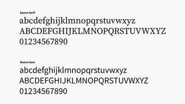
Our fonts, Source Sans Pro and Source Serif Pro have been chosen with inclusivity in mind. They retain an element of prestige and tradition, whilst being versatile enough to meet the needs of our audiences.

An example of the Source typeface family

Our core colours

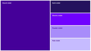
Derived from colours that have previously been associated with the University of Sheffield, our core colours: deep violet, powder blue and midnight black, are bold, meet high standards of accessibility and work in conjunction with our secondary palette.

The University's core colour palette

Our tone of voice

When we communicate with our audiences, we are guided by the following principles: 

  • We are inspiring, ambitious and inclusive.
  • We speak with genuine emotion, and show people they belong.
  • We are confident and collaborative.
  • We know exactly who we are and the value of working together.

Why has the University’s brand identity been updated? 

It’s really important that all elements of our brand meet modern accessibility standards and this was the key driver behind the update. Through internal audits, research, competitor analysis, and by engaging with stakeholders across the University, we know that the University of Sheffield’s previous brand ID (first created in 2005) is no longer fit for purpose. There have been issues with accessibility and how the visual identity could be used, particularly digitally.

While we know there are areas for improvement with our incumbent ID, it’s important to note that there are positive elements to the University’s identity. Rather than starting afresh, this project has evolved and enhanced our current identity, fixing the problems we have in application, especially digitally, to improve accessibility. 

Our focus has been to create a sustainable approach to our brand identity. This initial project will lay a foundation, allowing the University to continue to iteratively enhance it over time as application requirements change.

How has the University’s brand identity been updated?

Consultation with over 1500 people, including prospective students, current students, staff, alumni, disability champions and the general public, has helped us to develop and enhance our brand identity in a collaborative way. 

Using in-house expertise from within Corporate Communications and Print and Creative Solutions, we have updated our assets based on multiple rounds of testing that took into account accessibility, sentiment, and ease of use among many other factors. Care has been taken to retain links to the University's heritage.

How will the University’s brand identity be applied?

Application of our updated identity will be a gradual and iterative process. We're encouraging staff to continue using materials that contain the current ID where possible until there is an opportunity to replace these naturally - we are not asking staff to change or update materials straight away. This approach reduces waste.

Guidance on how to apply our identity can be found on our guidance webpages.

A global reputation

Sheffield is a research university with a global reputation for excellence. We're a member of the Russell Group: one of the 24 leading UK universities for research and teaching.